

Risk-adjusted return measures how much profit an investment generates relative to the risk taken to earn it, using a risk-free benchmark such as U.S. Treasury yields as the baseline. According to Investopedia, it accounts for the degree of risk involved so that two investments with different volatility profiles can be compared on equal footing. A portfolio that earned 12% by taking on extreme volatility may actually be less attractive than one that earned 9% with far less turbulence.
The practical takeaway: risk-adjusted metrics let you compare investments on a true apples-to-apples basis, not just by the headline return number.
The three most common ratios you will encounter are:
- Sharpe ratio: excess return divided by total volatility (standard deviation)
- Sortino ratio: excess return divided by downside deviation only
- Treynor ratio: excess return divided by market-related risk (beta)
Table of Contents
- Why does risk-adjusted return matter to individual investors?
- What are the primary risk-adjusted performance metrics?
- How do you calculate risk-adjusted return step by step?
- What are the limits and common misuses of these metrics?
- Which risk-adjusted metric should you use?
- Key Takeaways
- A practical investor’s perspective on risk-adjusted thinking
- Physical metals and risk-adjusted portfolio thinking
- Authoritative sources and further reading
Why does risk-adjusted return matter to individual investors?
Raw returns tell an incomplete story. A fund that gained 18% last year sounds impressive until you learn it swung 30% in either direction along the way. The Motley Fool frames it plainly: risk-adjusted metrics exist to answer whether “the reward justified the risk.” That question matters most when you are making real decisions with real money.
Three scenarios where this distinction becomes concrete:
- Retirement allocation: A retiree comparing two bond funds with similar yields needs to know which one carries more interest-rate or credit risk. The one with the higher Sharpe ratio is delivering more return per unit of volatility, which matters when you cannot afford a large drawdown.
- Evaluating an active fund: A manager who outperformed the S&P 500 by 4% may have done so by concentrating in a handful of volatile positions. Jensen’s Alpha and the Treynor ratio reveal whether that outperformance reflects genuine skill or just extra market exposure.
- Assessing a metals position during market stress: Physical gold and silver often behave differently from equities during volatility spikes. Calculating Sharpe or Sortino for a metals allocation during a stress period shows whether the position contributed risk-adjusted value or simply moved with the broader market.
Risk-adjusted metrics also inform specific portfolio decisions:
- Whether to rebalance toward lower-volatility assets after a strong equity run
- Whether an active manager’s fee is justified by alpha generation
- Whether a new allocation improves or degrades the portfolio’s overall Sharpe ratio
What are the primary risk-adjusted performance metrics?
Each ratio answers a slightly different question. Here are the formulas, use cases, and tradeoffs, drawing on guidance from the CFA Institute and Wall Street Prep.
Sharpe ratio
Formula: (Portfolio Return − Risk-Free Rate) ÷ Standard Deviation
Use it when you want to evaluate total volatility across any asset or fund. According to the Corporate Finance Institute, a Sharpe ratio above 1.0 is generally considered favorable, above 2.0 is very good, and above 3.0 is exceptional. These are rules of thumb, not hard cutoffs; the right benchmark depends on asset class and time period.
Sortino ratio
Formula: (Portfolio Return − Risk-Free Rate) ÷ Downside Deviation
The Sortino ratio penalizes only negative volatility, ignoring upside swings. It suits investors who care specifically about loss risk rather than total price movement. A fund with high upside volatility but rare drawdowns will score better on Sortino than on Sharpe.
Treynor ratio
Formula: (Portfolio Return − Risk-Free Rate) ÷ Beta
Beta measures sensitivity to market movements, not total volatility. The Treynor ratio is most useful for evaluating a diversified portfolio where unsystematic (company-specific) risk has been largely eliminated. CFA Institute guidance emphasizes that Treynor isolates systematic risk, making it the right tool when you want to judge performance relative to market exposure rather than total price swings.
Jensen’s Alpha
Formula: Portfolio Return − [Risk-Free Rate + Beta × (Market Return − Risk-Free Rate)]
This is the CAPM-based measure of manager skill. A positive alpha means the manager delivered returns above what the market risk alone would predict. A negative alpha means the opposite. It depends on CAPM assumptions and is sensitive to which market index you choose as the benchmark.
Modigliani-Modigliani (M2)
Formula: (Sharpe Ratio × Market Standard Deviation) + Risk-Free Rate
M2 converts the Sharpe ratio into percentage-return units, expressed relative to a benchmark. It answers: “If this portfolio had the same volatility as the market index, what return would it have produced?” That translation makes it easier to compare funds with very different volatility levels.
Comparison table
| Dimension | Sharpe | Sortino | Treynor | Jensen’s Alpha |
|---|---|---|---|---|
| Risk measure used | Standard deviation (total) | Downside deviation | Beta (systematic) | CAPM expected return |
| Best asset class fit | Broad portfolios, mixed assets | Equity funds, metals | Diversified equity portfolios | Actively managed funds |
| Sensitivity to outliers | High (upside swings inflate denominator) | Lower (ignores upside) | Moderate | Moderate |
| Benchmark dependence | Risk-free rate only | Risk-free rate only | Risk-free rate + beta | Market index + risk-free rate |
How do you calculate risk-adjusted return step by step?
The math is straightforward once you have the right inputs. Here is a step-by-step process you can replicate in Excel or Google Sheets.
Step 1: Choose your return period
Use consistent periods, monthly or annual, across all assets you are comparing. Mixing monthly returns for one fund with annual returns for another will distort every ratio.
Step 2: Select the risk-free rate
For long-term holdings (one year or more), the 10-year U.S. Treasury yield is the standard choice. For short-term strategies, a 3-month T-bill rate better matches the holding period. As Investopedia notes, duration mismatch between your chosen Treasury yield and your investment horizon can distort the ratios. Current rates are published daily at TreasuryDirect.gov.
Step 3: Compute excess return
Excess Return = Portfolio Return − Risk-Free Rate
Step 5: Divide
Apply the formula for whichever ratio you are calculating.
Worked numeric example
Assume a sample portfolio with illustrative values for portfolio return, risk-free rate, standard deviation, downside deviation, and beta.
Calculated ratios like Sharpe, Sortino, and Treynor can then be derived to understand risk-adjusted performance, with interpretation dependent on context rather than fixed cutoffs.
Spreadsheet formulas (Excel / Google Sheets)
Sharpe  = (B2 - B3) / B4
Sortino = (B2 - B3) / B5
Treynor = (B2 - B3) / B6
Where B2 = portfolio return, B3 = risk-free rate, B4 = standard deviation, B5 = downside deviation, B6 = beta. Pull the current 10-year Treasury yield directly from TreasuryDirect.gov and update B3 each time you recalculate.
What are the limits and common misuses of these metrics?
Risk-adjusted ratios are powerful, but they carry real blind spots. Knowing them prevents costly misreads.
- Cross-asset-class comparisons mislead. Comparing the Sharpe ratio of a gold ETF to that of a short-term bond fund is not apples-to-apples. Investopedia cautions that these metrics are most meaningful within the same asset class. A metals position will naturally show different volatility characteristics than investment-grade bonds, and a higher Sharpe for one does not make it universally superior.
- Look-back bias inflates historical ratios. A strategy that looks exceptional over a three-year bull run may have benefited from a specific market regime. Wall Street Prep warns that extremely high historical ratios often reflect one-time events or regime-specific outperformance rather than repeatable skill.
- Risk-free rate mismatch distorts results. Using a 10-year Treasury yield to evaluate a 90-day trading strategy overstates the risk-free baseline and compresses the excess return figure artificially.
- Non-normal return distributions break the math. Standard deviation assumes returns follow a bell curve. Assets with fat tails, like commodities or options strategies, can show deceptively favorable Sharpe ratios because extreme losses are underweighted in the standard deviation calculation.
- Small sample problems. Calculating Sharpe on 12 monthly data points produces a statistically unreliable estimate. Practitioners generally recommend at least 36 months of data, and even then, the confidence interval around the ratio is wide.
Pro Tip: Never rely on a single metric. Pair Sharpe with Sortino to understand whether volatility is mostly upside or downside, and check Jensen’s Alpha to see if returns are explained by market exposure or genuine skill.
To reduce these risks in practice: use consistent time periods across all assets you compare, apply the same risk-free rate to every calculation in a given analysis, and always check the underlying return distribution before trusting a ratio at face value.
Which risk-adjusted metric should you use?
| Your question | Use this metric |
|---|---|
| Compare total volatility across funds | Sharpe ratio |
| Focus on downside risk only | Sortino ratio |
| Evaluate performance vs. market beta | Treynor ratio |
| Assess manager skill beyond market exposure | Jensen’s Alpha |
| Compare funds in percentage-return terms | Modigliani-Modigliani (M2) |
| Understand market sensitivity of a holding | Beta |
Pro Tip: Match the risk-free rate duration to your holding period. Short-term strategy? Use the 3-month T-bill rate. Long-term allocation? Use the 10-year Treasury yield. Mismatching these compresses or inflates your excess return figure and skews every ratio you calculate.
Key Takeaways
Risk-adjusted return is the single most reliable way to compare investments with different risk profiles, and Sharpe, Sortino, and Treynor each measure a different dimension of that risk.
| Point | Details |
|---|---|
| Core definition | Risk-adjusted return measures profit relative to risk taken, benchmarked against U.S. Treasury yields. |
| Sharpe interpretation | A Sharpe ratio above 1.0 is generally favorable; always compare within the same asset class. |
| Sortino vs. Sharpe | Use Sortino when downside risk matters more than total volatility; it ignores upside swings. |
| Metric limitations | Look-back bias, non-normal distributions, and small samples can all make ratios misleading. |
| GoldRock Metal Exchange | Offers physical gold, silver, platinum, and palladium plus self-directed IRA services for investors building risk-aware portfolios. |
A practical investor’s perspective on risk-adjusted thinking
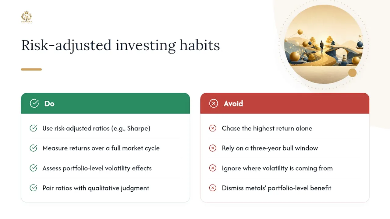
Most investors spend their energy chasing the highest return number they can find. The ratio rarely gets the same attention, and that is where portfolios quietly go wrong.
The metrics covered here are not academic exercises. They are the difference between knowing you earned 10% and knowing whether that 10% was worth the ride. A Sharpe of 0.46, like the example above, tells you the portfolio is generating less than half a unit of return for every unit of risk. That is not a disaster, but it is a clear signal to ask: where is the volatility coming from, and is there a better-structured allocation that keeps the return while reducing the drag?
The part most guides skip: these ratios are only as good as the period you measure. A three-year window that happened to include a historic bull run will produce flattering numbers for almost any equity strategy. That is not skill. Pull the data back to include a full market cycle, including a meaningful drawdown, and the picture often changes dramatically.
Precious metals are an interesting case in this framework. Their individual Sharpe ratios can look modest compared to equities during strong bull markets. But that comparison misses the point. The value of a metals allocation often shows up at the portfolio level, in the form of lower overall volatility during stress periods, which improves the whole portfolio’s risk-adjusted profile even when the metals position itself looks unremarkable in isolation.
Pair every ratio with a qualitative read on what has changed in the underlying asset or strategy. Numbers describe the past. Judgment covers what comes next.
This article is for general educational purposes only and does not constitute personalized financial, tax, or legal advice. Consult a qualified financial advisor or tax professional before making investment decisions.
Physical metals and risk-adjusted portfolio thinking

Physical gold, silver, platinum, and palladium often behave differently from equities and bonds during periods of elevated volatility. That behavioral difference can affect a portfolio’s overall risk-adjusted profile in ways that individual asset ratios do not fully capture. When equities sell off sharply, metals have historically shown lower correlation to those moves, which can reduce the portfolio’s aggregate standard deviation and improve its Sharpe ratio at the whole-portfolio level.
GoldRock Metal Exchange helps investors who want to act on that insight. Whether you are adding physical metals to a taxable account or rolling retirement savings into a self-directed Precious Metals IRA, GoldRock’s in-house IRA department handles the transfer process and provides personalized guidance at every step. Physical metals are delivered with insured private shipping, and the full product catalog, including gold, silver, platinum, and palladium, is available at GoldRock’s online store.
To discuss how physical metals might fit your portfolio’s risk-adjusted framework, request a free consultation today or call (888) 859-0978.
This content is educational and does not constitute personalized financial, tax, or legal advice. Speak with a qualified advisor for guidance specific to your situation.

Authoritative sources and further reading
- Risk-adjusted return – Investopedia
- Risk-Adjusted Return | Wall Street Prep
- Measures of risk-adjusted return – CFA Institute (PDF)
- Risk-Adjusted Return Ratios – Corporate Finance Institute
- Risk-adjusted return – The Motley Fool
- Risk-Adjusted Returns: Meaning, Formula, Types & How to Calculate – ETMoney